Cricinfo have redesigned their website so that it looks like one of those ones that scrapes your content and republishes it in breach of copyright. The home page in particular looks like some sort of template from GoDaddy.com.
The home page was dreadful before, in all honesty, but in an entirely different way. Previously it was weighed down by randomly placed subsections, each of which was overfilled. The new one is at least a little bit lighter – although it still feels a bit like someone’s said ‘is there some way we can make absolutely everything really prominent’.
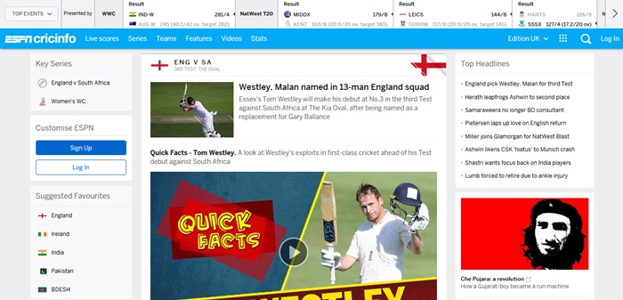
Viewed on a desktop, scorecards are too wide.
The explanation for the change is that they’re putting ‘mobile first’. Apparently no-one’s told Cricinfo that you can have completely different designs for mobiles and PCs through the magic of stylesheets. Even we do that and we’re so bad at this kind of thing that we haven’t even removed the empty menu dropdown on our mobile site.
The new Cricinfo is at least usable on a mobile now. The old version was unusable, so this redesign probably emerges in credit.
Historic scorecards aren’t showing for me at all, can anyone actually see the individual scores on this one for example?
http://www.espncricinfo.com/series/17487/scorecard/62703/England-vs-New-Zealand-4th-Test-New-Zealand-tour-of-England-1949
At this moment, scorecards earlier than 2003 don’t show.
But then T20 started in 2003, so I guess that year has been rebranded as Year Zero – nothing that REALLY matters happened before then.
Happy days.
To be fair, they did follow the responsive paradigm. Which means they won’t have to worry about stylesheets per medium anymore. If you think the scorecard is too wide on a desktop, you can just make your browser window a bit smaller and the site will adjust. That is pretty cool, although I agree that it could have been done a lot better.
Also: you’d think most cricinfo viewers would be office workers on a desktop, so I’m really interested in their usage data.
You think we’re going to spend our time narrowing and broadening windows every time we look at a scorecard?
Surely if you’re on this website then you, like us, open scorecards hundreds of times a day.
The alternative is keeping our eyes on a level from left hand side of screen to right so that we know who’s scored what, but you can imagine the state of our eyes after all that scorecard viewing. They ain’t going to track reliably.
Then there is something called as cricbuzz.com whose scorcard is much better to view and updates are much faster than cricinfo.
Responsive design is certainly very popular with website designers at the moment, but as someone who predominantly accesses the internet via a computer (not a phrase I would have imagined myself typing a few years ago) the huge amounts of wasted space are very annoying.
I have to say, though, that the very website you are reading this comment on has also moved to a more mobile-friendly (and therefore slightly less PC-friendly) design not that long ago.
Bring back the 1998 design, I say, complete with scorecards in Courier New and polls on such important and controversial matters as “Should players wear numbers in ODI’s?”
I would go further, APW.
I’d like to choose between the scorecard looking like an old-fashioned manual scoreboard (in the style displayed in the Lord’s pavilion), or Ceefax-style view.
In truth, my only beef with the new style scorecard on the PC is the giant adverts. Once you move those out of your way, the board seems to work fine. You just need to keep the tab live so you don’t need to go through all that palaver again.
On a cursory look at the ios version, it strikes me as much improved on the scorecards.
I’m just hoping that the scorecard archive issue is a temporary changeover thing and not a permanent withdrawal of service.
I think it’s an excellent idea. How else are you going to tell them apart?
Sure, they just did it badly. And I wouldn’t think that about “most” cricinfo viewers at all. I’m retired, at home and I use it constantly for modern and historic cards. One thing that’s missing is the details of the toss and that’s right across the piece: there’s not a single scorecard I can find, of any age, by any source or path, that shows it.
It looks like it’s been redesigned by someone, or a group of someones, who haven’t got a clue about cricket. Bah. Humbug.
It was. It’s the same design the American ESPN site has been using for a year or so now. And it did similar horrible things to baseball box scores when it was first rolled out, until they designed something specifically for that purpose. Hopefully they’ll fix the scorecards in desktop view, because they’re bordering on unreadable unless I resize my browser window.
It’s new, therefore I don’t like it.
I’m more annoyed that they haven’t addressed the biggest issue with Cricinfo. When I am trying to waste 40 minutes at work by doing an in depth review of Nick Knights Test career, it doesn’t help when videos that I don’t want to watch start randomly screaming at me.
I’ve not had this problem on the new site! But the live scorecards aren’t updating for me. Or Mike apparently.
Wait… they might have fixed it, you know.
In which case I might be forced to say that I prefer this setup. ????
I wasn’t around yesterday…
…(or rather, I was around but in a Board Meeting and other stuff that stopped me from even logging in to my computer, let alone checking the scores)…
…but from first thing this morning onwards the live scores seem to be working absolutely fine on my PC.
I like/prefer the little mini-tabs that help you get to different views, stats and even series tables (where appropriate) – all improvements, but to get to those you need to go through the adverts again. Clever, I suppose and after a while I suspect I’ll stop seeing the ads…
…much as I have completely stopped seeing the Asian babes, Russian brides, invest your spare £250,000 and Cricket Captain 2017 ads on this site.
I can’t test this yet as the only live match on at present, SL Pres XI vs Indians, doesn’t appear to have very regular updates.
I can’t see the pre-2003 scorecards either, only summaries of each innings.
When I search for a player I love seeing the top half of their head in the search results page.
I use the site almost exclusively from a PC at work – for mobile use it’s always the BBC site.
When you click on an old match (2003 onwards, at the moment) I want to see the full scorecard first up. That’s now an extra click away and the key details are less clear than they used to be (bigger text too in the default layout, which means less info on the page – I want to see as much info as possible on the screen without having to scroll). Also the match result disappears as soon as you scroll down, because it’s in a tiny bar at the top of the scrolling pane. This should be the most prominent information, surely.
So yeah, on balance I hate it.
The ads on Cricinfo tend to be quite… flashy. As in, they change regularly, and even the ads themselves move about a lot. Harder to get used to than KC’s static ads. Which, in turn, makes me less likely to whitelist them than KC’s static ads.
Thank you. We know ads are an annoyance, but site running costs only seem to grow whereas site income doesn’t.
You should probably try selling more stuff to us, yer maj. You could get away with a monthlyish book review, I think. Three a month in the run-up to Xmas. Reckon you’d be more likely to get a click-through on a cricket-related affiliate link than all those £250k portfolio for a Muslim Russian wife ads, or whatever else it is that the supercomputers have automagically decided is the most appropriate thing to flog here.
We never did get that review of Chris Gayle’s autobiography up, did we?
I’ve come to the conclusion that vireo autoplay is really a browser deficiency – there should be a browser setting that allows you to turn it off. Moreover, although browsers will mark tabs with an audio icon if they’re responsible for sound blaring out, you still need to track down and stop the video itself – it’s that or closing the tab. Why you can’t just right-click the tab and press “mute tab”, or even “stop videos”, I don’t know… Seems silly to give you an indication that sound is being generated from a tab without also giving you the option to turn it off.
Video not vireo. A “vireo” autoplaying sounds even more ominous than a video…
On Chrome, I’m fairly sure that clicking the audio icon mutes it…
Will give that a try next time it happens in Chrome, thank you!
I’m mistaken, but not far wrong: I do indeed get a mute option when I right-click the tab header. Hm.
I’m fairly sure I’ve turned off autoplay in both Firefox and Opera, and you can mute tabs in both. That’s a great feature if you want to spend an afternoon synching the muted video stream to the TMS youtube thingy because you can’t bear listening to the sky commentators anymore. And one or the other always buffers so they’re out of synch after a short while.
Hear, hear! What else is there to say about this, or about anything in fact.
Don’t get me wrong, I’m not against change – how else would things improve? But I prefer my change to have happened a few years ago. Ask us again about this new webpage design in three years. Only then will we be able to properly assess its pros and cons, instead of just recoiling in horror at the dreadful newness of it all.
No doubt in three years they will be on the cusp of changing it to something EVEN WORSE
That’s a fair point, but rather undermined by the fact that I’m still annoyed by their last major appearance update some 3 or 4 years ago.
Someone needs to urgently explain to them that there are colours other than white, grey and pale blue
Archive news: I have just googled the archive and found, for example, this:
http://static.espncricinfo.com/db/ARCHIVE/1880S/1888-89/
Note the static address.
So we can still see old archive stuff but (probably for the time being or possibly for ever) not on the new whizzy dynamic live thingamie-whatsit.
On the ‘device’ I am currently using, when I click through to the scorecard of, say, England’s rout of South Africa at Cape Town in March 1889 (Bobby “the Guv’nor'” Abel alone scored more in England’s innings than South Africa could manage between them in two attempts), the summary/etc are presented in the new format.
Same now on the PC – new format not old. That is definitely a change since this morning.
We need to entertain the possibility that they went live with this new thing before changing absolutely everything over.
I like it. Damn you all to hell.
Actually, on balance, I am with you, Deep Cower.
Especially on ios, Cricinfo is now a bigly improved and knocks the BBC site for six…I mean, “for an ESPN maximum!!”
They have successfully completely hidden the one thing that made cricinfo good – the ‘info’ bit.
Suppose it’s simpler really. Time to bookmark the statsguru page and never use the rest of it again
Goodbye CricInfo.
It is terrible design. They even have the guts to say comments are for facebook users only. I removed my facebook account when they announced their IPO. Not activating for any reason. I need to find where i can find an API that can give free live scorecard.